Best CV Colours: Examples & Tips
Last updated on 29 April, 2026

Maciej Staszek TomaszewiczWriter, Professional Association of Resume Writers and Career Coaches (PARWCC)

Our customers have been hired by*:
One way to make your CV stand out is to add a touch of colour. But what are the best colours for a CV, and how do different hues influence the impression you create?
Let me cover everything you need to know about CV colours: from the psychology of colours and industry preferences to practical tips, common mistakes, colourful template examples, and most frequently asked questions.
Create an effective CV in minutes. Choose a professional CV template and fill in every section of your CV in a flash using ready-made content and expert tips.
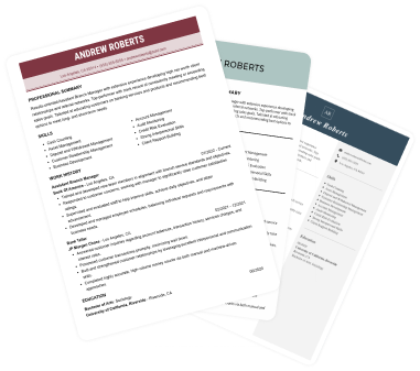
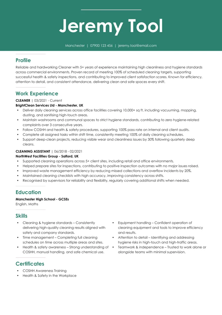
We created the sample on the right using our builder. See other good CV examples like this one.
Can you add colour to a CV?
Yes, you can add colour to your CV. When done correctly, it can be a strategic advantage. However, adding it the wrong way may result in a CV that’s difficult to read. Given that a typical recruiter spends mere seconds looking at it, your CV should appear professional.
Colour attracts attention and evokes emotion:
- Research shows that colour is a powerful visual tool: it helps information stand out and can even improve recall.
- A pop of colour, such as a coloured heading or line, can draw a recruiter’s eyes to key details and make your document more engaging at first glance.
- A well-chosen colour might subtly convey your personality or the “vibe” you bring.
Expert advice: Colour depends on context. In conservative industries or roles, too much colour can backfire: an overly bright CV might seem unprofessional. Conversely, in creative fields, colour can showcase design flair or individuality, depending on your industry and the impression you aim to create.
What is the best colour for a CV?
The most effective CV colours are subtle and sophisticated, used purposefully. Instead of ornamenting your CV, colour should quietly support its content. Usually, this involves pairing black or very dark text with a single carefully chosen accent colour on a white background.
Below are colour choices that work reliably well when you follow CV formatting tips:
Navy blue
Conveys trust, stability, and quiet confidence. It suggests reliability and sound judgment, making it a strong choice for leadership, corporate, client-facing, and decision-making roles. It’s one of the safest and most universally accepted CV accent colours.
Dark grey
Communicates modernity, composure, and professionalism. It feels serious without being rigid and works exceptionally well for technical, analytical, or contemporary roles where a clean, understated design is preferred.
Black
Represents authority, formality, and clarity. It signals seriousness and precision, which is why it remains the standard choice for highly traditional sectors such as law, finance, government, and academia. Black also ensures maximum readability across all formats.
Burgundy
Suggests maturity, confidence, and depth. It conveys authority without appearing aggressive and works well for senior positions, management roles, or industries where credibility and experience are key.
Forest green
Conveys balance, growth, and trustworthiness. It’s often associated with wellbeing, sustainability, and long-term thinking, making it well-suited to education, healthcare, environmental roles, and mission-driven organisations.
Teal
Communicates clarity, innovation, and approachability. It blends the stability of blue with the freshness of green, making it a strong choice for tech, digital, healthcare, and forward-thinking organisations that value both professionalism and modern thinking.
Slate blue
Reflects calm competence and thoughtful professionalism. Softer than navy, it adds personality without drawing undue attention, making it suitable for structured roles that still allow a contemporary edge.
Muted olive
Signals practicality, responsibility, and grounded thinking. When kept dark and low-saturation, it works well for environmental, nonprofit, operations, or logistics-focused roles where reliability and realism matter.
Deep plum
Suggests creativity, strategic thinking, and sophistication. It can be effective in creative, communication, or leadership roles when used sparingly, as it conveys originality while remaining polished.
Expert advice: If you find it challenging to choose the message you want to convey, choose the colour you add to your CV based on the industry you work in.
How to choose a CV colour (based on your profession)
Here’s a list of occupations and colours that suit them best. Adding them to your CV will help you demonstrate an understanding of industry expectations and visual professionalism. When used subtly, these colour choices can reinforce the qualities employers look for in your role and help your CV feel more relevant and intentional at first glance.
Law, finance, and conservative fields
Legal CVs should be traditional and professional, with little to no colour, typically black-and-white. A discreet accent colour, such as navy or charcoal, can add refinement, but bright colours are unprofessional and may be rejected in conservative environments.
Use muted, corporate shades just for headings or your name. The aim is to ensure seriousness, clarity, and compliance with professional standards.
Creative and artistic fields
Creative industries embrace colour in personal branding. Bold shades such as purples, greens, and yellows convey originality, which is a plus for an artist CV.
Use colour for headings, layout, and links, but keep dark body text for readability. Avoid busy palettes or neon combos that distract. Aim for an engaging, cohesive, and polished scheme that reflects creativity.
Marketing, tech, and modern industries
Modern sectors like marketing, tech, and start-ups prefer clean designs with thoughtful colour use. Blues, teals, and greens, or a signature accent, convey contemporary visual communication.
Use colour to highlight your name, section titles, or key skills, keeping the main text dark and legible. Bright colours can seem amateurish, but balanced accents reinforce a modern, professional, and tech-savvy image, fitting these industries.
Medical and healthcare
Healthcare CVs should evoke trust and calm, using blue to signal reliability and professionalism. Soft greens suit health-related roles.
Keep colours minimal, avoiding bright or playful tones in serious clinical settings. A clean layout with muted accents reinforces credibility and professionalism.
Education and academia
Academic and education roles, such as teaching positions, benefit from a traditional, text-focused CV.
Use muted colours like navy, green, or burgundy for headings or separators to boost structure and readability, especially on longer documents. These colours convey stability and seriousness, while bright tones could undermine credibility. A restrained palette emphasises organisation and qualifications.
Hospitality, tourism, and customer service
These fields favour warmth and approachability, so soft, friendly colours like gentle blues, teals, warm golds, or muted reds are effective.
Use colour sparingly for headings or key achievements to maintain a polished look. Avoid harsh contrasts or loud colours that seem unprofessional. A balanced, welcoming palette conveys service focus and keeps the CV clear and readable.
Engineering, manufacturing, and industrial trades
Precision-driven sectors benefit from clean, structured CVs with subtle, practical colour choices. If you’re writing an engineering CV, use strong, muted tones like navy, steel blue, charcoal, or dark green to signal reliability and competence.
Colour should organise information, not attract attention. Bright shades feel out of place in fields focused on accuracy and safety. A controlled palette with disciplined accents reinforces professionalism aligned with engineering and industrial work.
Nonprofits, NGOs, and social impact
Nonprofit roles favour warm, human-centred presentation. Soft greens, warm blues, and earthy tones suggest community, trust, and sustainability, creating a caring, mission-driven tone without seeming casual.
Avoid bright or corporate schemes that clash with the sector’s ethos. Use colour subtly to highlight roles and impacts, making your CV look organised, authentic, and aligned with the organisation’s purpose.
Human resources
HR roles benefit from calm, professional colours such as muted blues, teals, or purples that convey empathy and discretion.
Use accents to highlight sections or skills, while keeping body text dark and legible. Avoid bold colours that seem attention-seeking. A polished palette reinforces trustworthiness and clarity, essential qualities in HR.
Retail and e-commerce
Retail and e-commerce roles enable energetic, controlled colour use, with accents like teal, coral, or soft red conveying dynamism and customer focus.
Select tones matching brand aesthetics to highlight achievements or skills. Luxury retail may need deeper shades like navy or burgundy. Avoid overly bright combinations to maintain professionalism. A clean, modern layout supports a vibrant, customer-oriented image.
Real estate and property management
Real estate CVs benefit from trustworthy colours like navy, charcoal, and forest green, which convey stability, confidence, and professionalism, which are key qualities in client-facing roles.
Use colour to highlight headings, certifications, or sales results without cluttering the design. Bright tones may seem too informal or sales-focused. A refined palette enhances credibility and shows you can represent properties and clients professionally and reliably.
Public relations and communications
PR and communications roles require polished, brand-aware design. Use deep blues, purples, and teals for sophistication without overpowering the layout.
Use colour sparingly to guide readers and show aesthetic judgement. Avoid clashing or bold hues, as they suggest poor communication. A clean, cohesive palette signals a consistent messaging approach and professionalism, both crucial for external communication and brand representation.
Science and research (non-academic)
Scientific CVs should be precise and structured, using cool, muted tones like slate blue, teal, or deep green to reinforce professionalism and analytical thinking.
Limit colour to headings or skill categories for clarity, avoiding bright or unconventional colours that could undermine seriousness. A controlled, clinical palette conveys order and credibility, fitting laboratory or technical research contexts.
Sports, fitness, and wellness
This sector welcomes vibrant, health-inspired colours when used sparingly. Fresh greens, lively blues, or warm oranges can convey vitality and enthusiasm, especially for coaching or training roles.
Use accents to emphasise certifications or specialities, maintaining a clean and professional layout. Avoid neon or overly saturated shades that appear unrefined. A balanced, energetic palette supports a personal brand centred on wellbeing, movement, and a positive lifestyle.
Transportation, logistics, and supply chain
Choose practical, grounded colours like navy, dark grey, and deep green to reflect discipline and reliability.
Use colour to highlight certifications and key skills without cluttering the layout. Avoid bright tones that clash with the industry’s focus on accuracy. A streamlined palette enhances perception of dependability and logistical professionalism.
Education technology
EdTech combines academia with modern technology, using colours like teal, blue, or purple to demonstrate innovation and user focus.
Use colour to emphasise headings and highlights, ensuring they are accessible. Avoid bright or childish palettes to preserve professionalism. A clean, contemporary scheme fosters technical skills and effective learning.
Let me share an extra tip with you: you can always select a colour that matches the company you’re applying to. Companies use colours for their branding, and choosing one will show that you’re not interested in just any job but specifically in a position within that company. This makes your CV personalised right from the start.
Tips for choosing the best CV colours
Now that we’ve covered the most popular colours among different industries, let me walk you through a quick dos and don’ts list of adding a splash of colour to your CV.
| Dos | Don’ts |
| Limit your colour palette (1–2 accents): Use one main accent colour (and at most one secondary) alongside black or dark grey text. Stick to professional, muted tones: Opt for colours like navy, charcoal, deep green, teal, or burgundy.Maintain strong contrast for readability: Good contrast improves readability and helps ATS software process your CV correctly.Match colour to the role and message: Choose colours that reflect the industry and the qualities you want to highlight. For example, blue suggests reliability, green signals growth, and muted purple can imply creativity.Use colour to highlight, not decorate: Apply colour consistently to headings, your name, or key sections only. Test your CV in black and white: Print or view your CV in grayscale to ensure it stays clear and well-organised. | Use too many colours: Overloading your CV with multiple colours creates visual noise and makes it hard to focus on key information. A minimal, cohesive palette keeps your CV structured and professional.Choose neon or overly bright shades: Fluorescent or highly saturated colours draw attention for the wrong reasons and can appear unprofessional. If you like bold colours, opt for darker or muted versions instead.Apply poor contrast and readability: Low-contrast combinations, such as light text on a light background or dark text on dark colours, make your CV difficult to read. Always prioritise clarity, especially for black-and-white printing and accessibility.Let design overpower content: Colour should support your experience, not distract from it. Excessive graphics, coloured text boxes, or decorative elements can confuse both recruiters and ATS systems.Ignore industry expectations: Colours that work in creative fields may feel inappropriate in conservative roles. Always match your colour choice to the tone of the industry and the position you’re applying for. |
Best colourful CV templates
To inspire you, here are some of the best examples of colourful CV templates. These modern templates show how to use colour effectively in a CV, each with a brief description of the colour usage and why it works well:
Contemporary Contrast
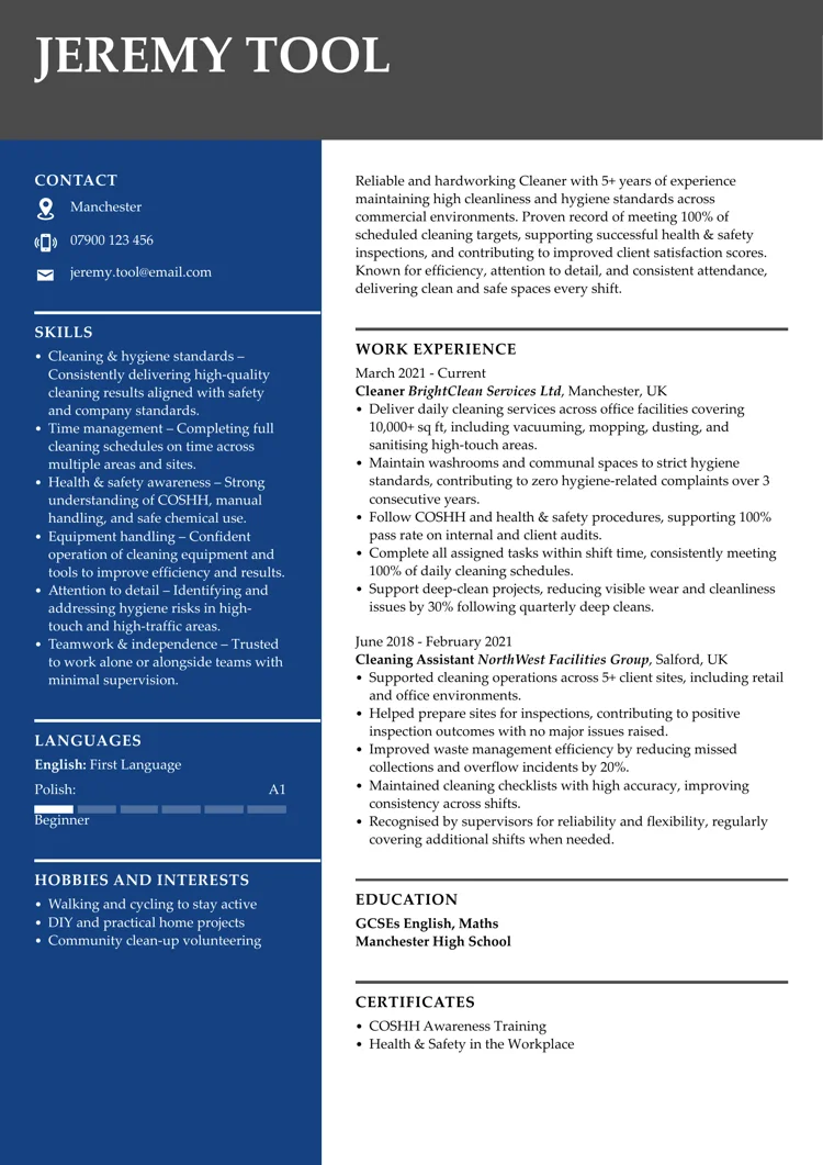
A balanced blue catches the eye while maintaining a highly professional impression. Paired with a dark bar featuring a name, it creates a striking CV template that will be remembered.
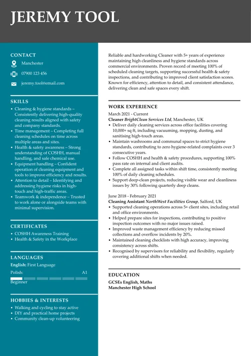
Tranquil Chroma dark green
An example of excellent colour usage throughout the CV. You can see dark green in the header and in each CV section heading, which enhances the readability of the entire document.
Minimal Sleek dark red
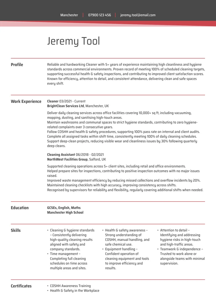
As you can see, even a bold colour like red can be used on a CV if applied effectively and sparingly. Those lines perfectly capture the reader’s attention in this creative CV template.
Elegant black
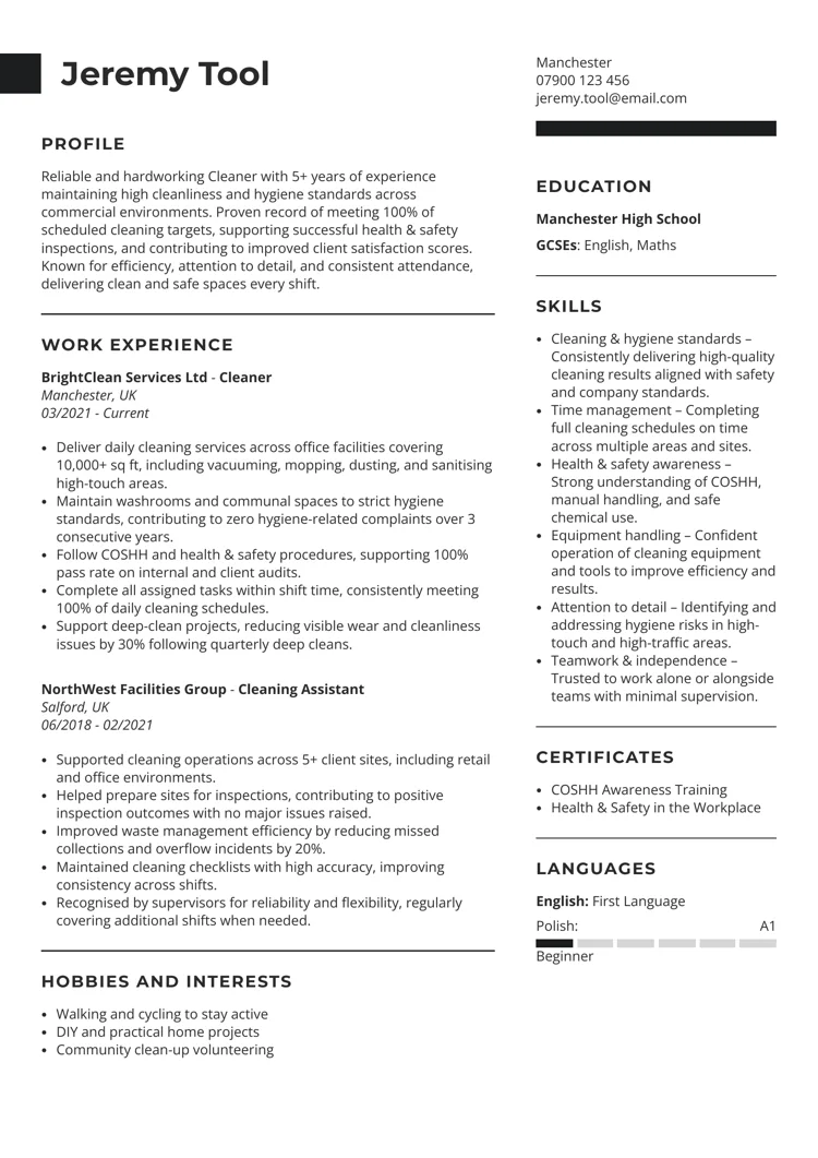
Sometimes less is more. Choosing black over other colours might be a good idea, especially when choosing a minimalistic CV template.
Once you choose a colour for your CV, there are more guides you might want to see:
- Best AI CV Makers & Builders You Should Test
- CV AI: Should You Use AI to Make a CV?
- CV Writing Services to Help You Write Your CV
- How to Write a One-Page CV Document
- Free CV Templates You Can Use With Ease
- How to Add a CV to LinkedIn?
You don’t have to be a CV writing expert. In the LiveCareer CV builder you’ll find ready-made content for every industry and position, which you can then add with a single click.
How we review the content at LiveCareer
Our editorial team has reviewed this article for compliance with LiveCareer’s editorial guidelines. It’s to ensure that our expert advice and recommendations are consistent across all our career guides and align with current CV and cover letter writing standards and trends. We’re trusted by over 10 million job seekers, supporting them on their way to finding their dream job. Each article is preceded by research and scrutiny to ensure our content responds to current market trends and demand.
Sources
About the author
Maciej Staszek Tomaszewicz
Maciej is a certified career expert who brings over a decade of expertise in crafting tailored CVs and cover letters. He combines deep industry knowledge with a friendly, accessible writing style, aiming to empower job seekers with practical tips and insightful career advice.
Looking for a job-winning CV?
Crafting a job-winning CV is all about showcasing your unique skills and experiences. Start with a strong personal statement that highlights your career goals and achievements.
Try Our CV Builder Now