Best Font for CV – Top Fonts, Sizes & Formatting Tips
Last updated on 20 April, 2026

Danuta DetynaWriter, Professional Association of Resume Writers and Career Coaches (PARWCC)

Our customers have been hired by*:
But there’s one easy improvement for your CV that’s so obvious you probably don’t even see it. It’s your font choice. It’s easy enough to ask what the best font for a CV is, but it’s a different story when it comes to actually choosing it.
This guide includes a selection of the best fonts for your CV, as well as tips and tricks for CV font formatting and style that will improve your job application.
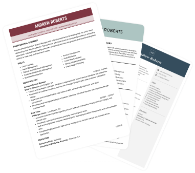
Create an effective CV in minutes. Choose a professional CV template and fill in every section of your CV in a flash using ready-made content and expert tips.
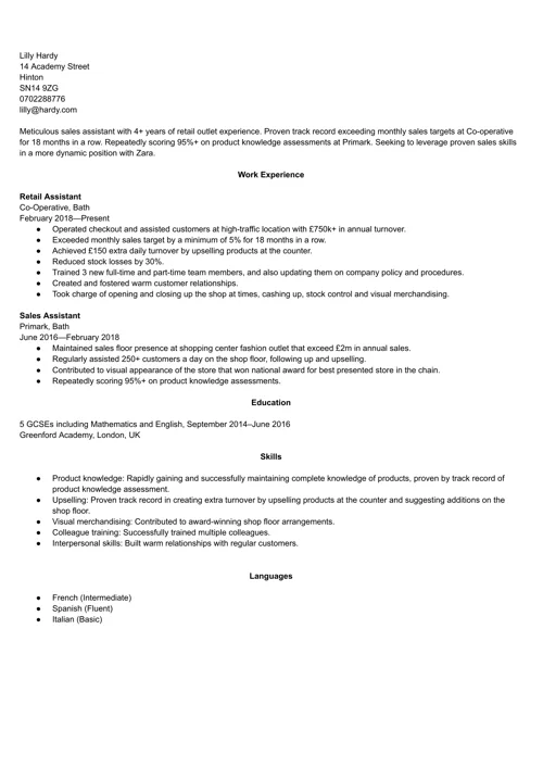
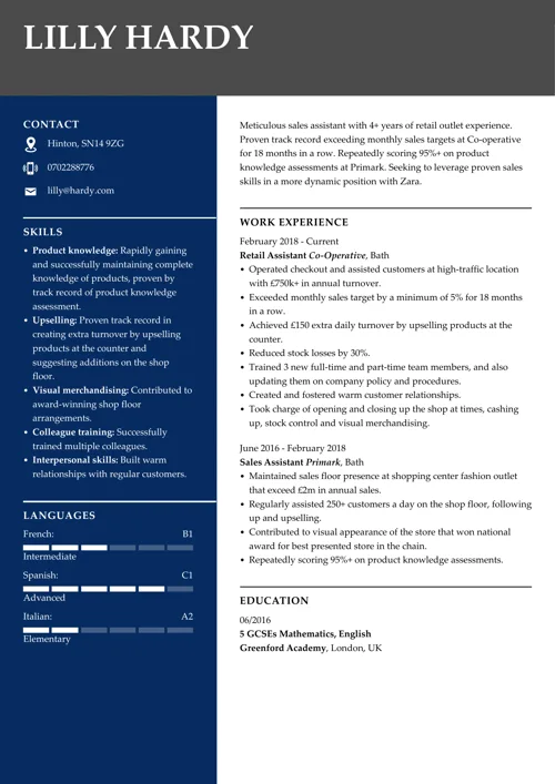
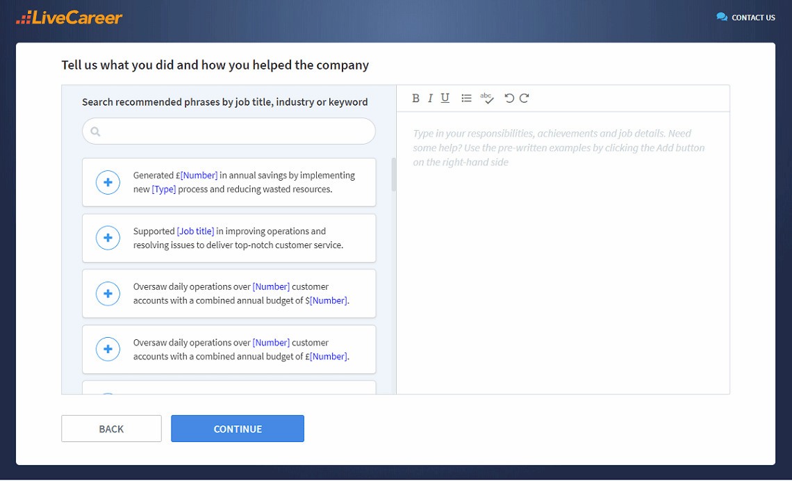
We created the sample on the left using our builder. See other good CV examples like this one.
What is the best font for a CV?
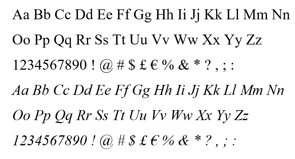
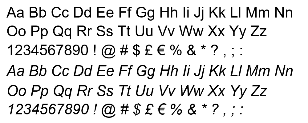
The most popular fonts for a CV include Arial, Times New Roman, and Calibri. They’re particularly known for their readability and professional appeal.
- Arial is modern and clean
- Times New Roman offers a classic and formal look
- Calibri is easy to read on both screens and paper
When choosing the best CV font, select one that is easy on the eye yet captures the reader’s attention. Avoid overly decorative fonts, as they can hinder readability. Your font choice significantly impacts how your CV is perceived, increasing the chances that your application will be considered for the next recruitment round.
5 Key font types to consider before picking a CV font
Before digging deeper into the best CV font choices, you should understand the five key font types. It will simplify the process of picking the most suitable font for you.
1. Serif
Serif fonts feature small strokes attached to the larger end strokes of letters. One of their greatest advantages is that they remain easily read even when formatted in smaller sizes. A representative of a popular serif font is Times New Roman.
2. Sans Serif
Sans-serif fonts lack the small decorative strokes at the end of the main strokes of the letters. Unlike serif fonts, sans-serif fonts lack additional embellishments and therefore have a cleaner, more modern appearance.
3. Script
Script fonts aim to emulate the fluid strokes of cursive handwriting, providing a more natural feel. They can be either formal or casual and are frequently used for logo creation.
4. Monospaced
Monospaced fonts, originally designed for typewriters, allocate the same horizontal space to each letter. People use them for coding, although they may be less readable in other contexts.
5. Display
Display fonts are designed for large sizes and are suitable for billboard messages or highlighting essential information. This category encompasses a diverse range of font families, including both serif and sans-serif options.
A strong CV summary will convince the recruiter you’re the perfect candidate. Save time and choose a ready-made personal statement written by career experts and adjust it to your needs in the LiveCareer CV builder.
Best fonts for a CV in 2026
Here’s a complete list of the best fonts for a CV for the UK market.
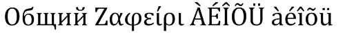
1. Garamond
I chose this as our first pick because of its long and distinguished history. It was originally designed by Claude Garamond in the early 16th century and is well-known for its elegant, timeless design. You’ll recognise Garamond by its relatively high contrast between thick and thin strokes, and distinctive letterforms.

Source: Microsoft
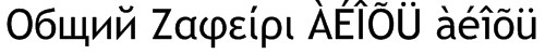
2. Times New Roman
No list of the best CV fonts would be complete without Times New Roman. It was commissioned by The Times of London in 1931 and is widely regarded as the most popular serif font, known for its legibility and classic design. Times New Roman is an excellent choice for conveying a conservative, professional tone in your CV.
Source: Microsoft
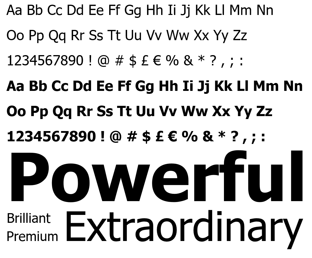
3. Arial
Arial is one of the best-known fonts to use in a CV. Packaged with every version of Windows since version 3.1 back in 1992, it’s the default font of choice for many. It’s also the most popular sans-serif font, giving your CV a more modern look. Because of its high readability, it is used in both digital and print materials, including websites, documents, and presentations.
Source: Microsoft
4. Calibri
Another well-known sans serif font, Calibri, has been around since the early 2000s and, in 2007, became the default font for the Microsoft Office suite. Its creator, Lucas de Groot, describes it as having a ‘warm and soft character.’ Its soft, rounded curves are pleasing to the eye and make it one of the best font styles for a CV.


Source: Microsoft
5. Cambria
Cambria is another younger font type, first designed in 2004. It’s another example of a serif font, and its overall feel is more square and angular than Calibri or Arial.
A word of caution with this one, though: design experts say it’s an excellent font for reading on screen, but it doesn’t work well when printed onto paper (see Cambria alternatives). Thankfully, though, that’s a rare occurrence these days, so it’s still one of the best fonts for a CV.

Source: Microsoft
6. Helvetica
Helvetica was created in 1957 and designed for exceptional clarity, particularly for use on signs. Considering the average recruiter takes less than 10 seconds to read your CV, you want them to take in as much as possible as fast as possible. That’s why Helvetica might be one of the best fonts for your CV, keeping it readable and concise.


Source: MyFonts
7. Gill Sans
Gill Sans is one of the best fonts for a CV in the UK. It’s uniquely British. It was created in 1927, inspired by the London Underground’s corporate font. Furthermore, it was used on Penguin Books covers and was the BBC’s official font. It’s iconically British, and its striking sans-serif look will make a fine addition to your CV.


Source: Microsoft
8. Trebuchet MS
Trebuchet MS is a good alternative to Arial. It’s one of the best fonts for a CV if you want a clean, sans-serif look while still standing out from the crowd. It was named after a siege weapon that hurls rocks at the enemy, similar to a catapult. Use this for your CV, and it will launch your career like its medieval namesake.


Source: Microsoft
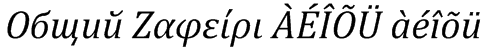
9. Didot
Didot dates back centuries; it was first developed in late 18th-century France. Its use of fine hairline elements gives it a style and sophistication that some standard fonts lack, so I’d consider it a strong choice for a CV in creative industries.


Source: MyFonts
10. Tahoma
You’re probably already familiar with Tahoma, another font that Windows popularised. It’s a sans-serif font similar to Verdana, with narrower letters and tighter spacing. That’s a real advantage if you want to add more content to your page. After all, the best CV length is 1–2 pages, so if you’ve overrun by a line, try switching to Tahoma.
Source: Microsoft
Best CV fonts by industry
A good CV font doesn’t just affect readability; it also sends a subtle message about your personal brand. The same font that looks perfect for a graphic designer might feel out of place on a solicitor’s CV. Below, you’ll find some simple guidelines to help you match the font on your CV to your target industry.
Traditional sectors (law, finance, public sector)
For more conservative roles, choose fonts that feel classic and reliable.
- Good choices: Times New Roman, Garamond, Georgia, Cambria, Calibri, Arial
- Why: These fonts are familiar, formal and easy to read, which suits employers who value tradition and professionalism.
Corporate and office-based roles (HR, admin, operations, sales)
In most corporate environments, a clean, modern font works best.
- Good choices: Calibri, Arial, Helvetica, Cambria, Tahoma
- Why: These fonts look professional on screen and on paper, and they pair well with standard CV templates and business documents.
Tech, IT and engineering roles
For technical roles, clarity and precision matter more than flair.
- Good choices: Arial, Calibri, Helvetica, Tahoma, Verdana
- Why: These sans-serif fonts are very clear even at smaller sizes and on multiple screens, which makes them ideal for digital-first applications.
Creative, marketing and media roles
If you’re applying for a more creative role, you can add a little character – as long as readability comes first.
- Good choices: Didot, Trebuchet MS, Gill Sans, Garamond for headings; Arial, Calibri, Helvetica for body text
- Why: A slightly more distinctive font for your headings (for example, Didot or Gill Sans) can suggest creativity, while a simple sans-serif font for your main text keeps your CV easy to scan.
Early-career and graduate CVs
If you’re just starting, keep your font safe and straightforward unless you’re targeting a very creative industry.
- Good choices: Calibri, Arial, Georgia, Tahoma
- Why: These fonts look clean and professional, and they won’t distract from your education and skills.
Expert advice: Whatever sector you’re applying to, it’s worth quickly checking the company’s website or existing materials. If they use a very modern, minimalist font, a clean sans-serif like Helvetica or Calibri will match nicely. If their branding is more traditional, a serif typeface such as Times New Roman or Garamond can help your CV align with their style.
Best CV font size in the UK
CV font size is just as important as font type. Too big and you won’t fit in enough content. Too small and you risk making it unreadable.
So, what size font should a CV be? The sweet spot is 10–12 pts for your body text, and you can go 4–6 pts larger for your section headings and your name in the CV header. Just make sure all font sizes are consistent throughout the whole document.
The larger size adds emphasis, but there are other ways of using fonts to highlight significant information, and I’ll explain those next.
CV font formatting in a nutshell
Font size and font type aren’t the end of the story when it comes to effectively using fonts in your CV. Here’s how to format your fonts to make your CV even more readable.
1. Bolding
Bolding makes your text appear darker and heavier. It’s a great way of making the most important information stand out. I advise you not to overuse it, though, as it’ll lose its impact. Reserve it for the most essential information, such as your name and job titles in the work experience section.
2. Italicising
Italicising makes the font slant to the right, and it’s based on old-fashioned calligraphic handwriting. It’s an old trick dating back to 1500 and an ideal way to emphasise small chunks of text. I’d recommend you use it even more sparingly than bolding. A good place to use it is for the name and location of your employer in your work history.
3. Font pairing
You can actually use two different types of fonts in your CV, and this trick is called font pairing. The key is to use fonts that complement each other and create a cohesive CV design. A good example is pairing a sans-serif font with a serif font to create balance. You could use one font for your name and section headings and another for your body text.
4. What not to use
There are other ways of drawing attention to the text in your CV. However, they’re less favourable. Here’s what to avoid when formatting your CV:
- Underlining. It looks messy and adds clutter to the page. A good CV layout should maximise white space and clarity.
- CAPITALISING. This will work for your section headings, but don’t use it elsewhere. Otherwise, it looks like you’re shouting.
- Highlighting. Perfectly fine if you’re writing notes, but not really a good option for your CV. Just like underlining, it’s messy and distracting.
CV font formatting examples
Finally, here are some examples of font formatting done well.
Sales Assistant
Energi Corporation, London
September 2018–Present
This extract from a work experience section makes good use of bold and italics. Just remember to be consistent with formatting throughout your CV.
A-levels: Physics, Chemistry, Mathematics. September 2013–June 2015
Enfield Academy, London, UK
This example is from a CV education section, again adding emphasis with bold and italics.
Skills
- Teamwork
- Attention to detail
Here is an example of font pairing and differing font sizes. Didot, as a larger serif font section heading, complements the smaller body text in sans-serif Arial.
What’s in a typical CV? We analysed 6 million CVs made with our builder*:
- Users create a CV in around 26 minutes
- Over 60% of CVs have less than 300 words
- Most users list 6 skills in their CVs
- Most jobseekers had fewer than 3 jobs
*The data comes from a period of 12 months (August 2023–August 2024).
What to remember when choosing the best font for a CV?
Your font choice may seem trivial, but it can actually have a powerful effect on the reader. Some fonts are notoriously unacceptable for professional purposes. Write your CV in Comic Sans or Papyrus, and it will likely be rejected.
Here are a bunch of tips to consider before choosing what font to use for a CV:
1. Aim for readability
Choose from fonts that are easy to read on-screen and print. Clarity should be decisive in ensuring your CV is accessible and professional.
2. Opt for classic fonts
Pick fonts like Arial, Helvetica, Calibri, or Times New Roman. These font styles are commonly recognised and available on most systems, thus guaranteeing consistency (and they match basic CV templates, too).
3. Consider industry standards
Be aware of any industry-specific font preferences. Certain professions or sectors may have standard expectations, so aligning your font choice with industry norms is crucial.
4. Maintain consistency
Keep a consistent font throughout your CV template to create a polished and cohesive CV look. Avoid using multiple fonts, which can make your CV appear cluttered. If you want to use colour in your CV, apply it subtly to headings and your name.
5. Keep the right font hierarchy
Use font styles and sizes strategically to establish a hierarchy in your CV. Employ a slightly larger font or bold style for section headings and a standard font for the main body text. This will help recruiters read your CV with ease.
6. Make sure your font is ATS-friendly
Applicant Tracking Systems (ATS) scan your CV to extract key information, so your font needs to be easy for both humans and software to read. An ATS-friendly font ensures your CV can be correctly interpreted by recruitment software and increases your chances of passing the initial screening stage.
To stay ATS-safe:
- Use standard system fonts such as Calibri, Arial, Cambria, Georgia, Tahoma, Verdana, Times New Roman, Helvetica or Garamond.
- Avoid decorative, script or handwriting fonts, which can cause parsing errors or appear unprofessional.
- Stick to readable sizes: avoid going below 10 pts for body text.
- Keep your layout clean: avoid placing text within graphics, images, icons, or text boxes, as ATS software may skip or misinterpret them.
- Use simple formatting: bold and italics are fine, but avoid unusual symbols, decorative bullets, or complex formatting elements.
You don’t have to be a CV writing expert. In the LiveCareer CV builder you’ll find ready-made content for every industry and position, which you can then add with a single click.
How we review the content at LiveCareer
Our editorial team has reviewed this article for compliance with LiveCareer’s editorial guidelines. It’s to ensure that our expert advice and recommendations are consistent across all our career guides and align with current CV and cover letter writing standards and trends. We’re trusted by over 10 million job seekers, supporting them on their way to finding their dream job. Each article is preceded by research and scrutiny to ensure our content responds to current market trends and demand.
Sources
- Rochester Institute of Technology Rochester Institute of Technology (2018), Evolution of Garamond: An Interactive Timeline Demonstrating the Evolution of Garamond
- The Ladders (2018), Eye-Tracking Study
- N. Hojjati, B. Muniandy (2014), The effects of font type and spacing of text for online readability and performance
About the author
Danuta Detyna
Danuta Detyna is a Certified Professional Résumé Writer and career expert with over nine years of writing experience. Known for her empathetic, detail-oriented approach, she creates practical and empowering career resources that help job seekers move forward with confidence.
Looking for a job-winning CV?
Crafting a job-winning CV is all about showcasing your unique skills and experiences. Start with a strong personal statement that highlights your career goals and achievements.
Try Our CV Builder Now